

OPEN PLAN
ARCHITECTURE
In 2018 Belgian architect Bruno Spaas discovered a space, an empty shell, on the top floor of a 15-storey tower building in Antwerp and with his newly founded architectural office, he initiated a capacious and free-spirited project that could serve as his future business card. He had no intention of living there and planned to sell it. However, on its completion Spaas realised what a unique and uncommon home it would make for him and his family.
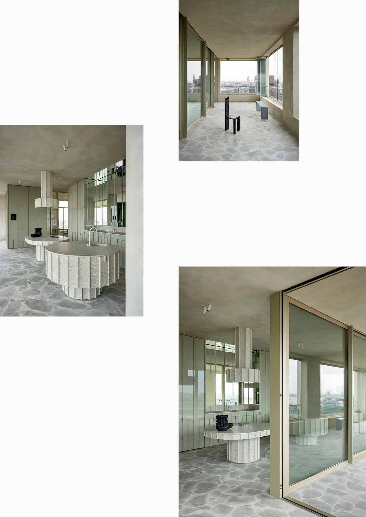
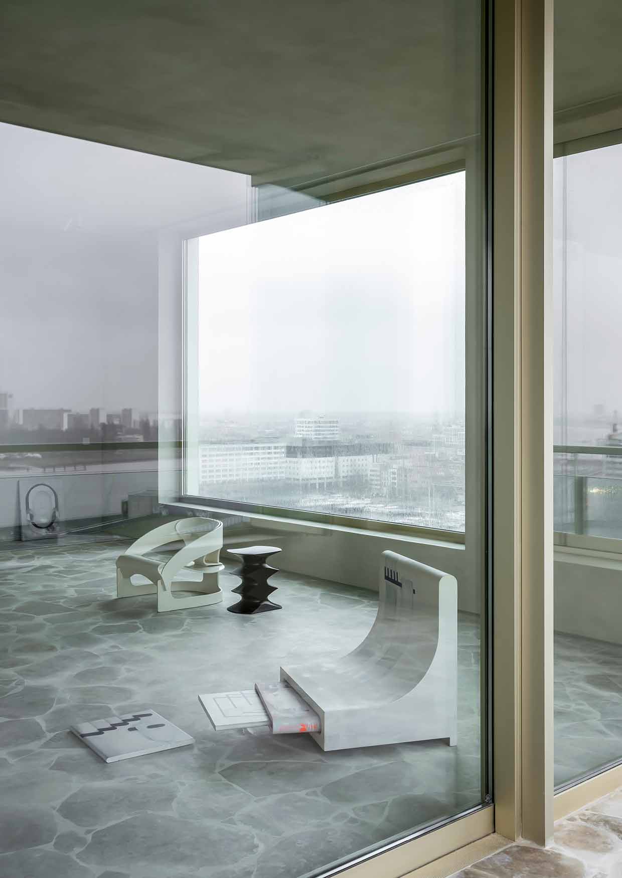
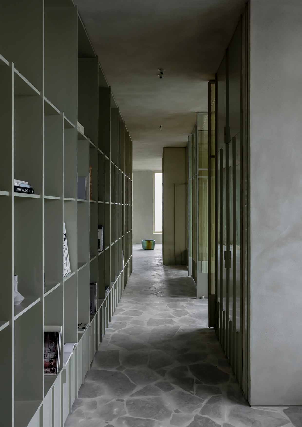
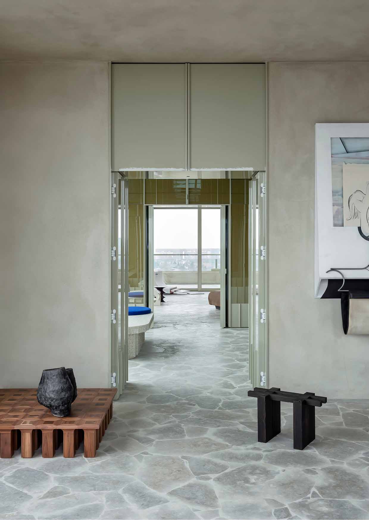
Arriving from a dim elevator landing and stepping into the entrance space, visitors are met with an exceptional view of the Antwerp city centre. The labyrinthine floorplan has no dead ends, just seamless connections, transparent spaces and smooth surfaces that astound with myriad reflections of city life. Views and scenery change around every corner, and the interior design work intrigues with its contrasted materials: beige and brown tones used on surfaces throughout the apartment are set against unexpected blues and greens inside cabinets and built-in furniture. The matte stone floors and clay textured walls are countered by mirrors and glossy cabinet doors.
“I would like to put a smile on people’s faces when they step in here,” acknowledges the architect.
Read more in Ark Journal VOLUME IX.
WORDS SISSE BRO
PHOTOGRAPHY PIET-ALBERT GOETHALS
STYLING PERNILLE VEST
ZUCCHETTI AND FRIENDS
A custom-built showroom in Milan exhibits new design-driven Zucchetti collections like works of art.
JOURNEY’S END
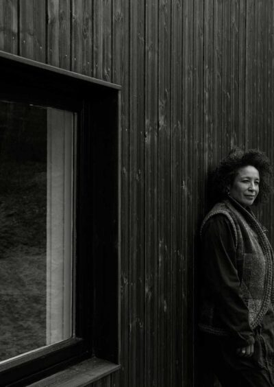
A 90s portable church has found its home on a secluded hill in the forest, becoming a contemporary respite for creation and reflection for Josephine Akvama Hoffmeyer.
CASE STUDY
— DISSONANT BEAUTY
As in music, interior design calls on many elements – rhythm, contrast, repetition – to create that most subjective of visions: beauty.

OPEN PLAN
ARCHITECTURE
In 2018 Belgian architect Bruno Spaas discovered a space, an empty shell, on the top floor of a 15-storey tower building in Antwerp and with his newly founded architectural office, he initiated a capacious and free-spirited project that could serve as his future business card. He had no intention of living there and planned to sell it. However, on its completion Spaas realised what a unique and uncommon home it would make for him and his family.
Arriving from a dim elevator landing and stepping into the entrance space, visitors are met with an exceptional view of the Antwerp city centre. The labyrinthine floorplan has no dead ends, just seamless connections, transparent spaces and smooth surfaces that astound with myriad reflections of city life. Views and scenery change around every corner, and the interior design work intrigues with its contrasted materials: beige and brown tones used on surfaces throughout the apartment are set against unexpected blues and greens inside cabinets and built-in furniture. The matte stone floors and clay textured walls are countered by mirrors and glossy cabinet doors.
“I would like to put a smile on people’s faces when they step in here,” acknowledges the architect.
Read more in Ark Journal VOLUME IX.
WORDS SISSE BRO
PHOTOGRAPHY PIET-ALBERT GOETHALS
STYLING PERNILLE VEST
