

BACKYARD REFUGE
SMALL SPACES
Small but perfectly matched, two residences in a courtyard are reduced to the essentials using quality materials and maximum light to create welcoming tranquillity.
Moving from the grand 18th-century facade of a central Copenhagen apartment building
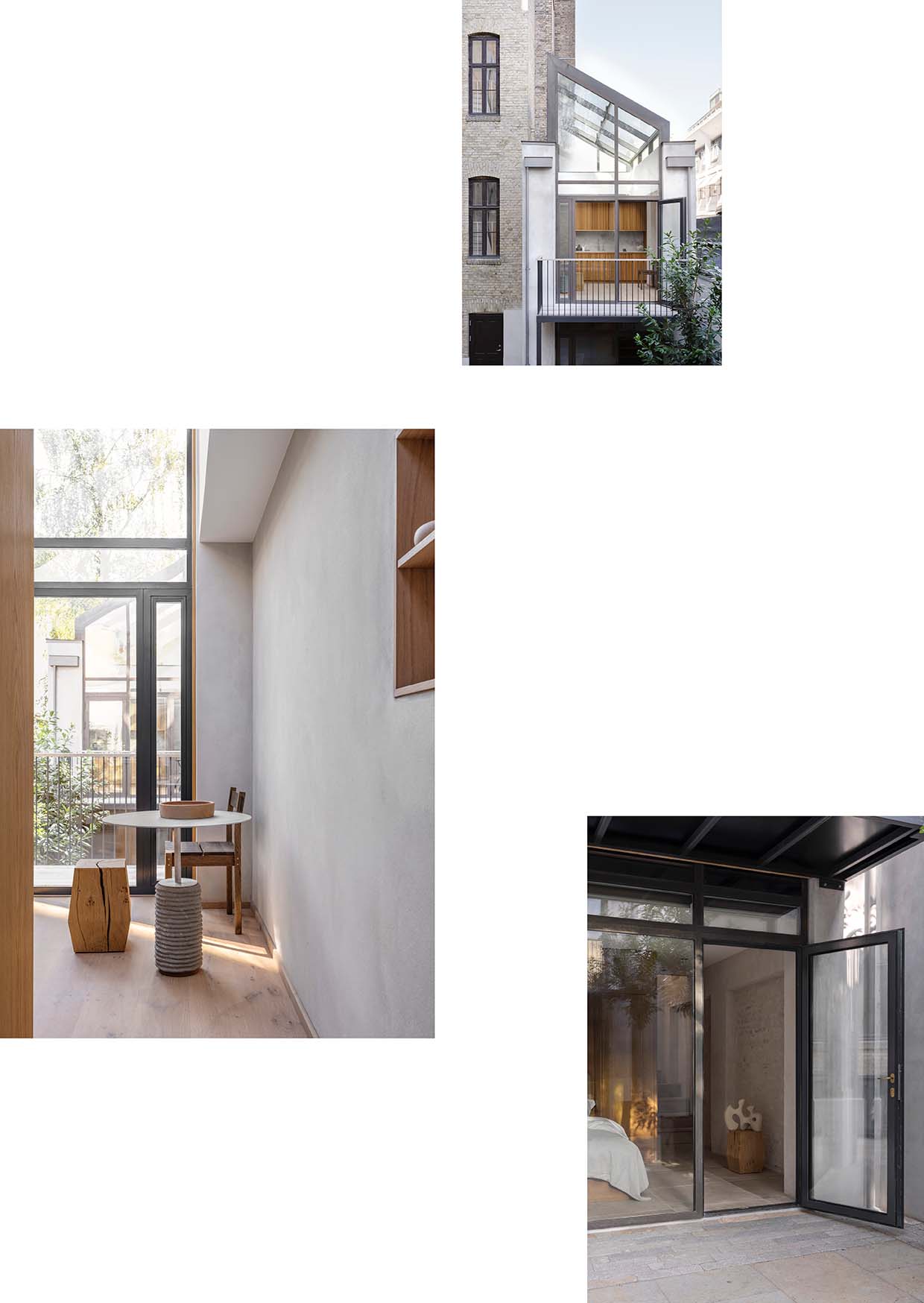
through its modest courtyard, one is surprised to find two narrow two-story buildings facing each other, neatly tucked into the corners of the yard. The sibling houses mirror each other perfectly. Although their faces are clad in glass, they reveal little beyond warm oak panelling as the large windows endlessly reflect the scenery.
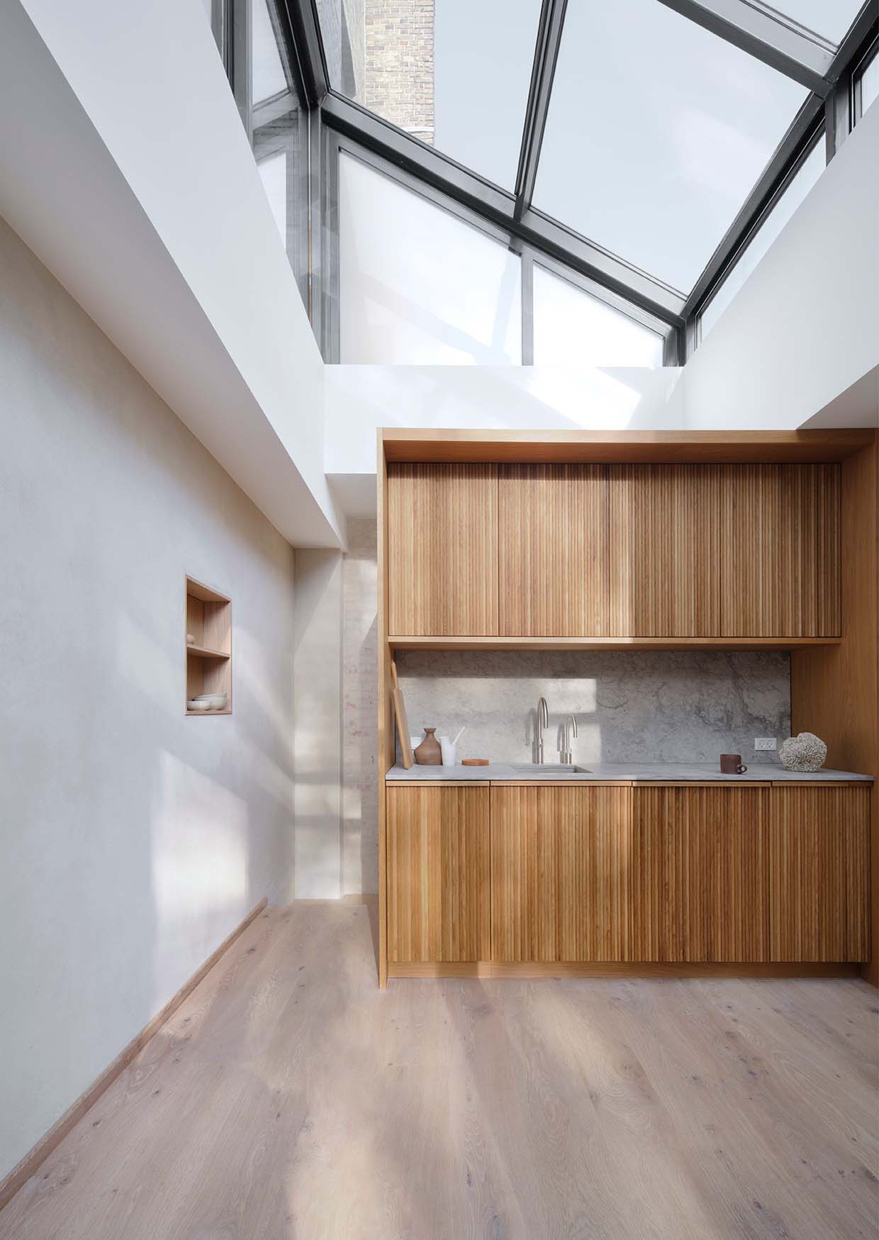
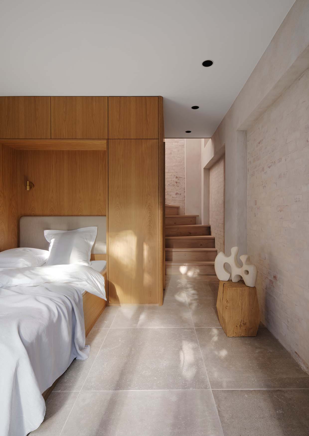
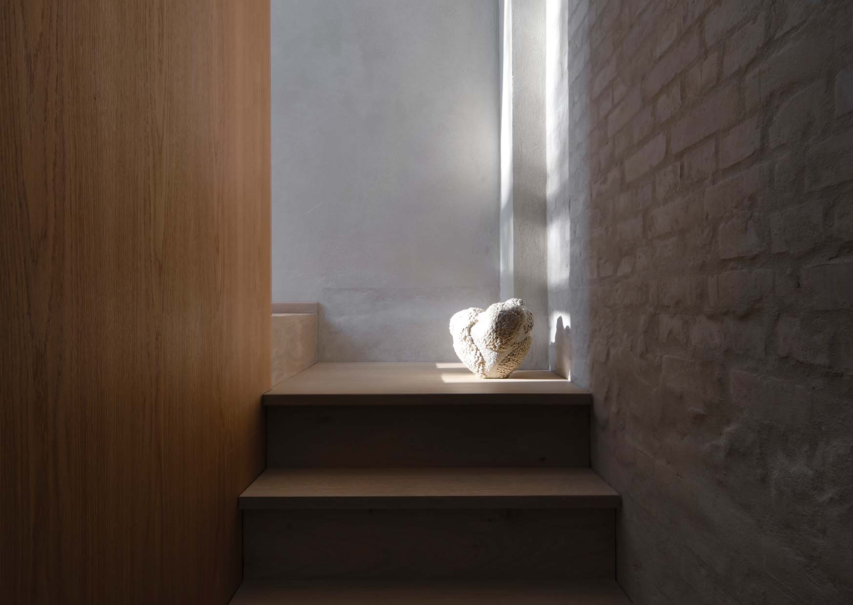
In order to make room for the client’s guest quarters and art residency, the former garages were mostly gutted aside from the main walls, classic examples of skilled Danish masonry. While Elgaard Architecture produced the exterior work, raising a structure in lush smoked bronze, architecture and design studio Vermland meticulously crafted a compact, yet profoundly tranquil interior. “As the top floor ceiling is glazed, the whole back wall spanning two floors bathes in light, as if luring you to make your way inside and up the stairs,” says Anton Bak, co-founder of Vermland. “As you enter, you should feel a sense of warmth and being welcome rather than a hotel-like rigidity.”
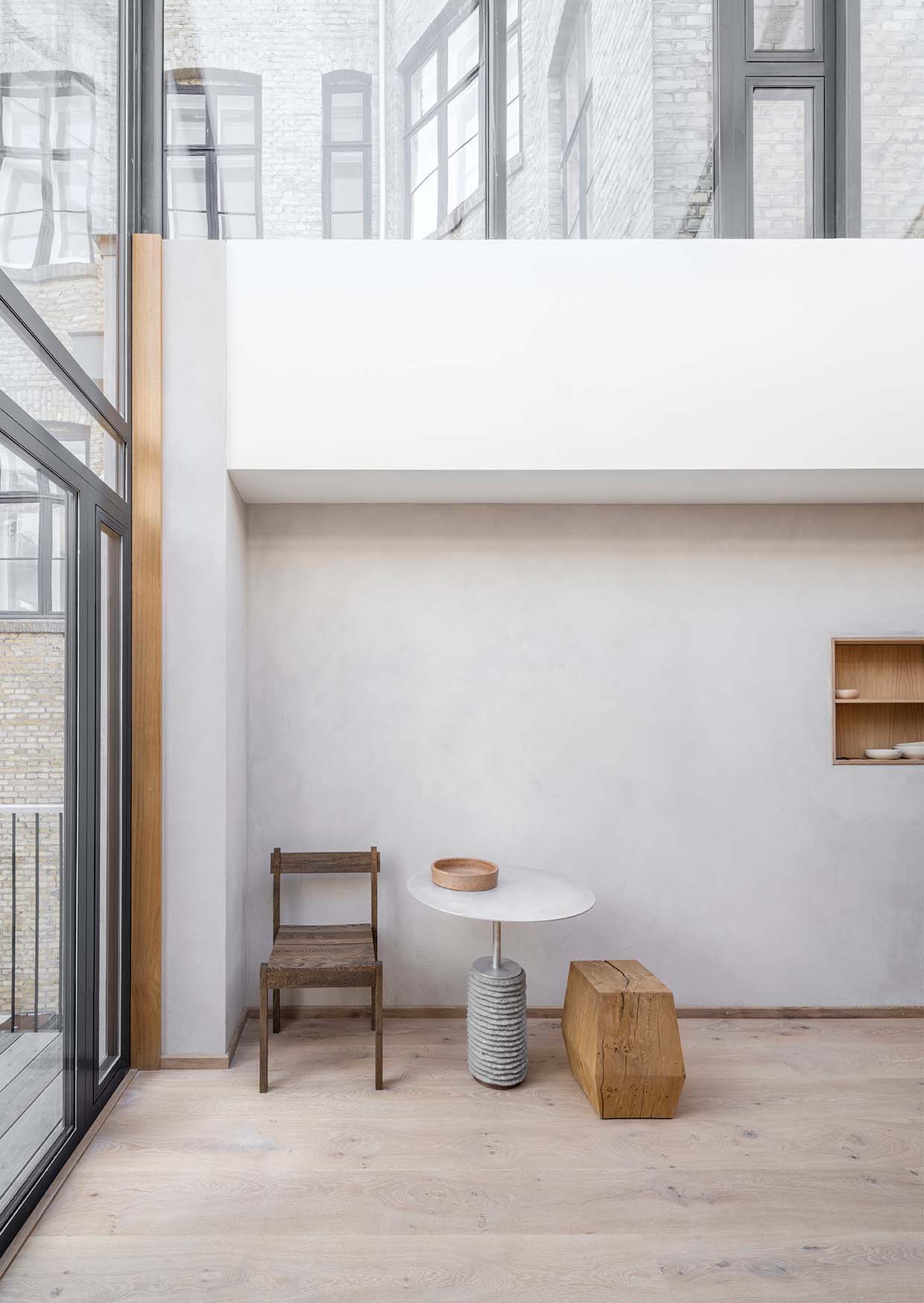
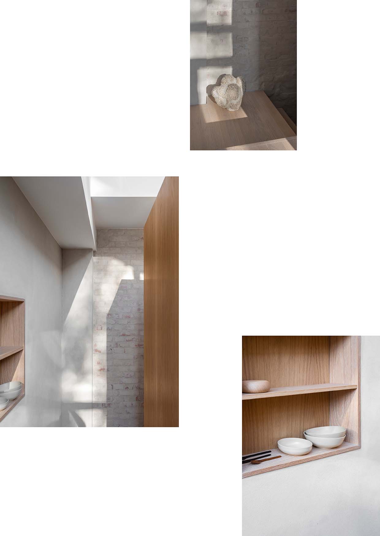
Bak explains that in the guesthouses light itself becomes matter, as it is absorbed by the sanded walls with their matt and grainy finish. Contrasting the slightly raw coolness of the walls is a significant spatial intervention, a wooden core in oak that stretches from the ground floor through the second. It holds all essential functions, housing a bathroom of Tundra Grey marble and custom-made brass fixtures as well as the upper-floor kitchen and built-in cabinets. “With limited space, storage can be so crucial. Being able to come in and put away what is not needed creates a sense of visual serenity,” says Bak. “When there are but few things around, every single element matters more.
Drawing on his own experience living in a small rebuilt boathouse in the harbour of Copenhagen, Bak insists that small-scale offers the opportunity of focus. “In these cases you can really get to the essence of a space, eradicating all of the noise. There is something deeply human about small spaces, as if they reveal more of their nature and thereby tell a more honest story. You can walk through the door and actually take it all in in a genuine way.” He suggests: “People should try to set up some room dividers at home and see the wonders it can do to clear your head.”
PHOTOGRAPHY RENÉE KEMPS
STYLING PERNILLE VEST
WORDS ALISA LARSEN
CREATIVE TRANSITIONS
Based on the loops and twists of the Möbius strip, an icon of mid-century Mexican design has become an integral part of the creative process for its custodian, designer and ceramicist Perla Valtierra.
THE REAL PHILLIP LIM
Phillip Lim has changed. The designer sees beauty in another way and his simple beachside shack on Long Island was a catalyst to a shift in perspective and priorities.
DOWN SIZE, UP CYCLE
When creative director at Marimekko Rebekka Bay and her husband Ricky Nordson decided to scale down their lives and living space, they knew their new Copenhagen apartment would require tailor-made design solutions.

BACKYARD REFUGE
SMALL SPACES
Small but perfectly matched, two residences in a courtyard are reduced to the essentials using quality materials and maximum light to create welcoming tranquillity.
Moving from the grand 18th-century facade of a central Copenhagen apartment building
through its modest courtyard, one is surprised to find two narrow two-story buildings facing each other, neatly tucked into the corners of the yard. The sibling houses mirror each other perfectly. Although their faces are clad in glass, they reveal little beyond warm oak panelling as the large windows endlessly reflect the scenery.
In order to make room for the client’s guest quarters and art residency, the former garages were mostly gutted aside from the main walls, classic examples of skilled Danish masonry. While Elgaard Architecture produced the exterior work, raising a structure in lush smoked bronze, architecture and design studio Vermland meticulously crafted a compact, yet profoundly tranquil interior. “As the top floor ceiling is glazed, the whole back wall spanning two floors bathes in light, as if luring you to make your way inside and up the stairs,” says Anton Bak, co-founder of Vermland. “As you enter, you should feel a sense of warmth and being welcome rather than a hotel-like rigidity.”
Bak explains that in the guesthouses light itself becomes matter, as it is absorbed by the sanded walls with their matt and grainy finish. Contrasting the slightly raw coolness of the walls is a significant spatial intervention, a wooden core in oak that stretches from the ground floor through the second. It holds all essential functions, housing a bathroom of Tundra Grey marble and custom-made brass fixtures as well as the upper-floor kitchen and built-in cabinets. “With limited space, storage can be so crucial. Being able to come in and put away what is not needed creates a sense of visual serenity,” says Bak. “When there are but few things around, every single element matters more.
Drawing on his own experience living in a small rebuilt boathouse in the harbour of Copenhagen, Bak insists that small-scale offers the opportunity of focus. “In these cases you can really get to the essence of a space, eradicating all of the noise. There is something deeply human about small spaces, as if they reveal more of their nature and thereby tell a more honest story. You can walk through the door and actually take it all in in a genuine way.” He suggests: “People should try to set up some room dividers at home and see the wonders it can do to clear your head.”
PHOTOGRAPHY RENÉE KEMPS
STYLING PERNILLE VEST
WORDS ALISA LARSEN
